3 DIFFERENT CONCEPTS


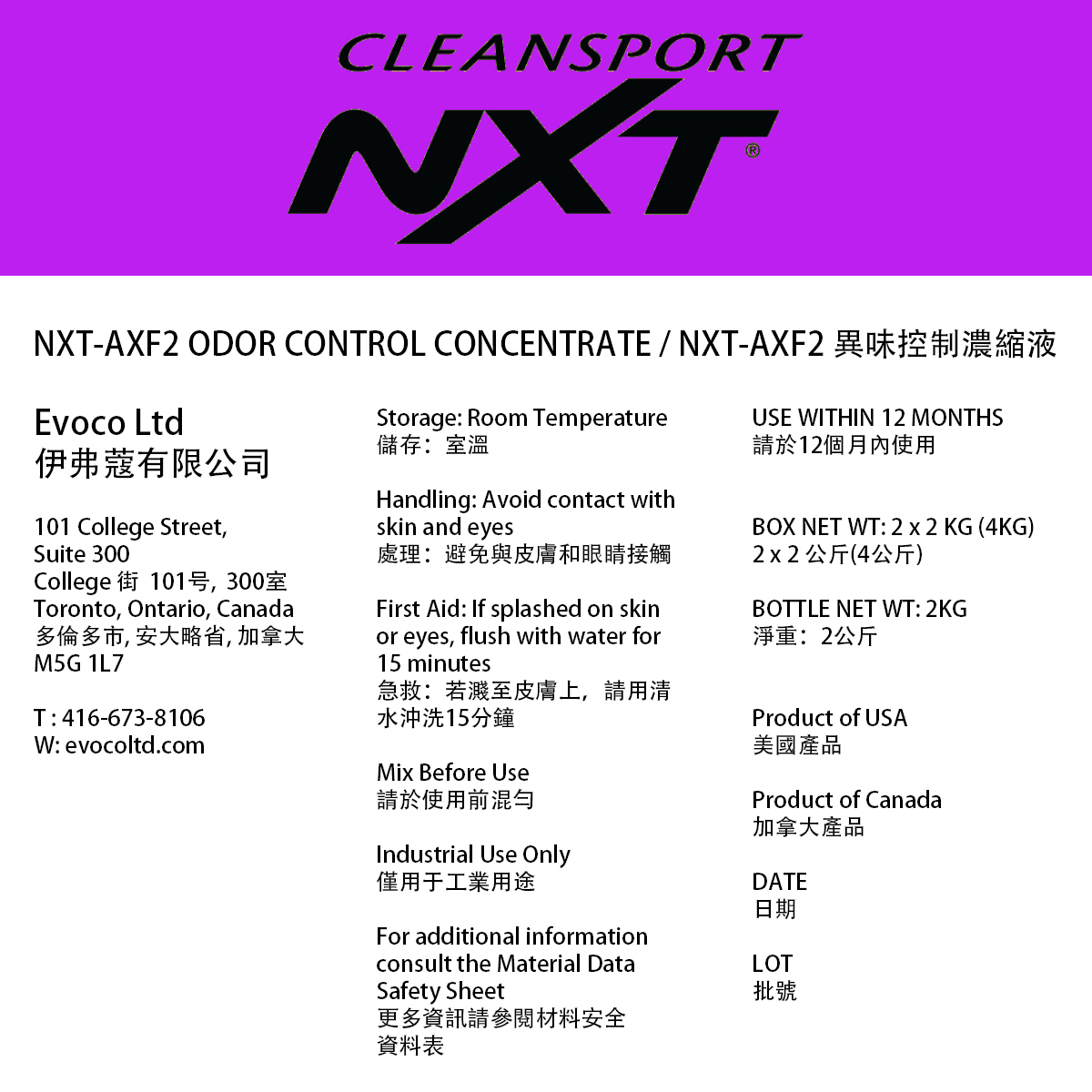
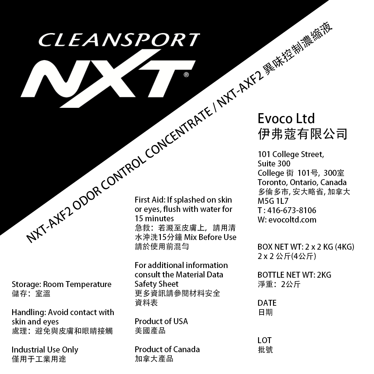

CHOSEN FINAL CONCEPT
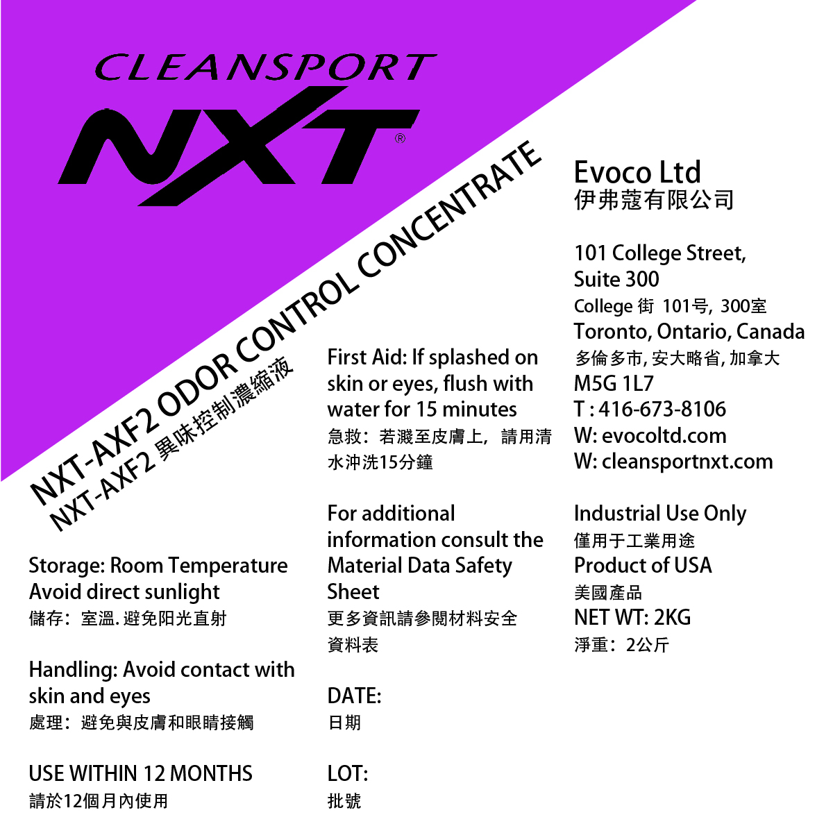
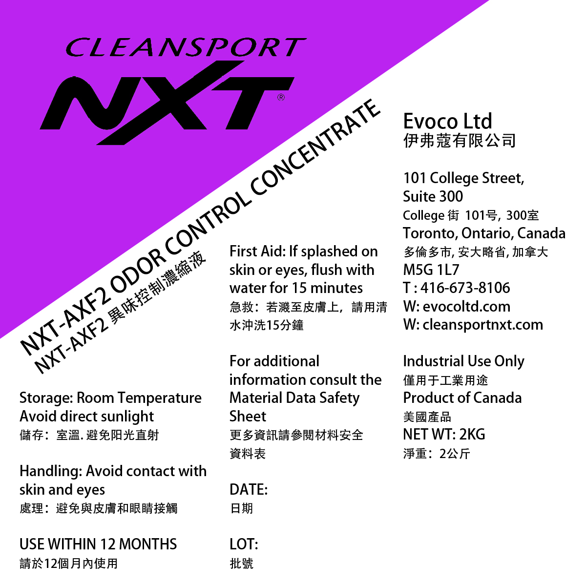

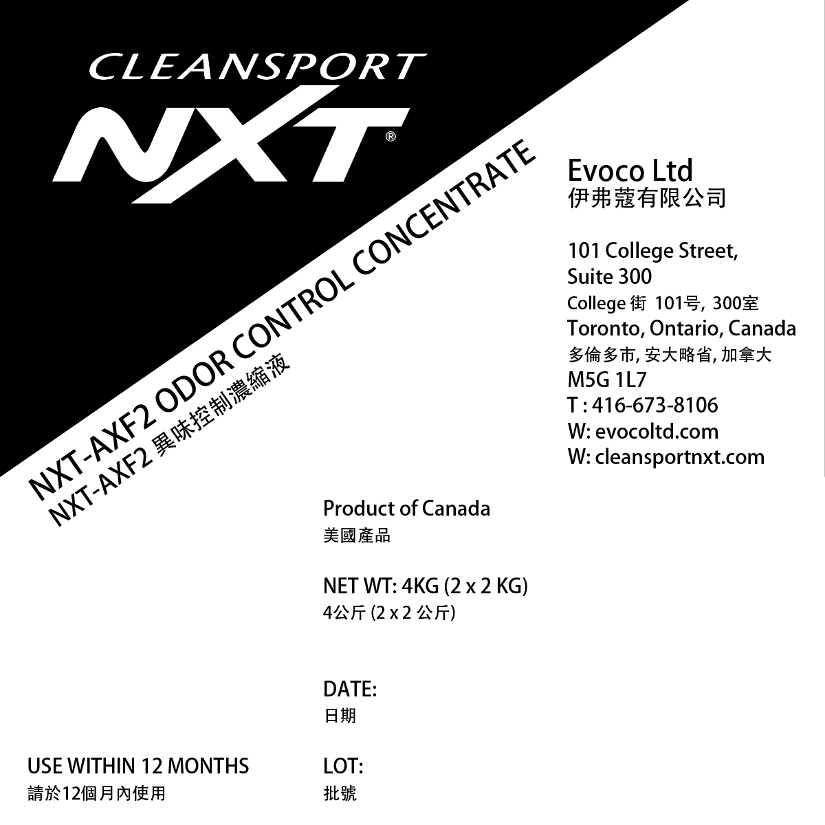
STUDY CASE
3 different concepts above in B&W and colour. Dimensions 4″4″.
Design Advise
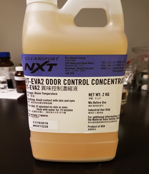
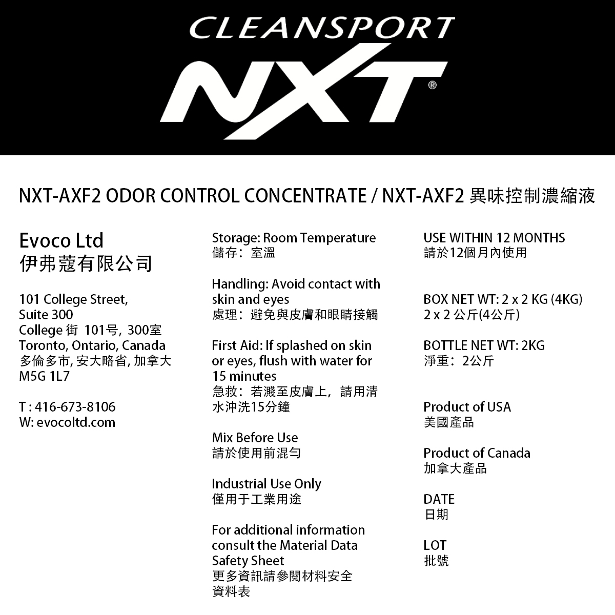
- Problem of frontal visibility with a bottle label that is 6″x4″ because the label is too large (image below).
- Standard size: most cost-efficient solution for the labelling, suitable for industrial production. Thus, saving paper, prepress and postpress time, content modifications and design time.
- Aesthetic and technical (including durability) problems, when applying the label on the bottle the label gets detached on the sides because of the irregular bottle surface.
- For safety reason, the information is pertinent and relates to both items in the bottle and the box.
- An important part of the design process is to test to validate the design, so it is better to try the concepts in the products (bottle and box)
- Please note that the initial concepts are not meant to be perfect, rather the final concept.
- Clean, minimalist, modern, and sophisticated look that reflects a contemporary and trendy premium aesthetics, works well for the Asian market.
- Advantages:
- Concept 1: sporty dynamic layout, eye catching
- Concept 2: good information hierarchy and categorization
- Concept 3: minimal clean look and good information framing
Original label